What is a submark and how to effectively implement one in your brand strategy
We’ve all heard the phrase, “Your brand is so much more than a logo, it’s a feeling.” And while this is very much true, it leaves many of us confused and frustrated that we can’t just have a logo designed and be done!
Creating a cohesive brand strategy that evokes an emotion includes the thoughtful design and implementation of a multitude of variables including (but not limited to) your:
PRIMARY LOGO DESIGN
FONT SELECTION
COLOR PALATE
PHOTOGRAPHY, PATTERNS & TEXTURES
PRINT AND ONLINE LAYOUT DESIGN
AND MY FAVORITE: YOUR SUB-MARK
What is a sub-mark LOGO?
A sub-mark logo is an extension of your logo that contributes to the emotional response you want from your viewer. It is an alternate representation of your brand that can be used when you need something at a smaller scale allowing you to communicate your brand quickly.
When I first dive into a brand strategy call with my clients, one of the most crucial topics of discussion is establishing how a sub-mark will be used in conjunction with the primary logo design. While designing, it’s important to be working on the primary logo and sub-mark logo simultaneously. Why? This ensures your sub-mark is actually contributing to your overall brand strategy instead of looking like a forced addition “because it’s the cool thing to do.”
Determining HOW you will effectively implement a sub-mark into your brand strategy is initially determined by the TYPE of primary logo you are drawn to. And to do that we have to first ask the question:
Are you drawn to icon based OR text based logo design?
Let’s help your brain wrap around what I mean.
ICON BASED LOGOS or LOGO MARKS are what we typically think of when we traditionally think of a logo. These types of logos:
Rely heavily on a creative geometric element OR representation of a specific thing, place or being to create an identifiable brand.
Font selection is and should be a strong focus in design but IS NOT the driving force for brand recognition.
The icon is almost always used to create the sub-mark of the brand.
TEXT BASED LOGOS, are also referred to as “logotypes” or “wordmarks.” These types of logos:
Require selective font selection as they rely heavily on the shapes of each individual letter to evoke an emotion.
Can use a combination fonts known as “font pairing” to create more interest.
Rely heavily on the effectiveness in the layout of each word and letter in each word.
Can include an icon in the design, but the focus is on the text itself. Ultimately, the text is able to stand alone without the help of the icon to be visually unique and identifiable.
4 ways to implement a sub-mark that actually helps your brand strategy, USING both ICON and TEXT BASED LOGOS.
Remember the GOAL is to create a sub-mark that CONTRIBUTES to your brand strategy. It is an extension of the brand that not only gives you flexibility when it comes to scale, but actually HELPS with brand recognition.
1 - INCORPORATE A GEOMETRIC SHAPE AS PART OF YOUR SUBMARK LOGO
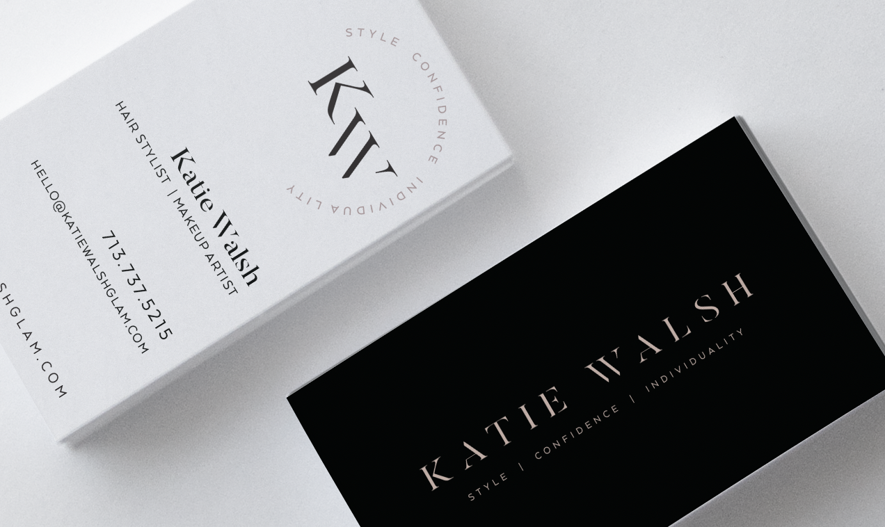
Here we chose to add a hexagon to the design while playing with outlined and reversed out variations. This shape became a prominent extension to the brand and ads to the overall brand strategy.
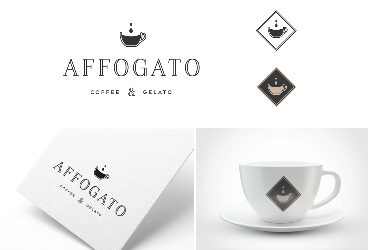
Same idea can be applied to an icon based logo. The obvious pull here would be the cup icon. But alone it doesn’t ADD to the brand. We add the diamond. But let’s take it a step further and apply the color palate to the icon for more variety further establishing brand recognition.
2 - ADD AN ELEMENT THAT REPRESENTS THE SERVICE BEING OFFERED OR PRODUCT BEING SOLD
Again the icon is the logical pull, and it does well on it’s own. But let’s contribute more to the brand by adding a simple graphic representing the services offered, in this case painting. We can also apply the brand color palate to this concept further allowing the sub-mark to be an extension AND an addition to the overall brand strategy.
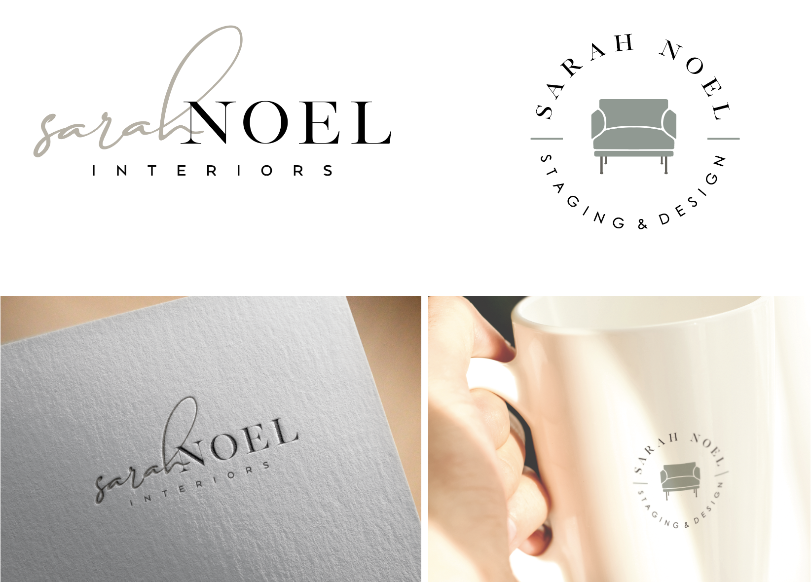
For a text based logo we are added the shape of one of this interior designers FAVORITE types of chairs that she likes to bring into most of her staging projects. This requires a bit more patience when it comes to establishing brand recognition for BOTH elements, but when done right, you accomplish the best of both a beautiful wordmark and an icon logo.
3 - CREATE AN INTERESTING LAYOUT WITH TEXT IN YOUR SUB-MARK LOGO
This starts falling into the category of a “secondary logo” and can’t be used at super small scales, but it does add visual interest while allowing a new brand to use the sub-mark more often before the icon is recognizable enough to stand alone.
We loved the circle icon alone as a watermark logo for her photos, but also wanted a mark we could communicate the brand name in while we established brand recognition.
4 - CREATE AN INTERESTING GEOMETRIC SHAPE THAT DOESN’T APPEAR IN THE PRIMARY LOGO
This is harder to implement. It requires consistency, more visual impressions on the viewer, and good to use of the color palate and photography to bring it all together. When done well this can be extremely effective in extending the brand far past the primary logo. I love taking brands this direction when we love a clean text based primary logo.
Ignore traditional branding “rules.”
It’s important to acknowledge that when it comes to branding, “there’s more than one way to skin a cat.” (Gosh I hate that term because I love my cats…but you know what I mean.)
There may be times when adding a sub-mark is completely unnecessary, or just needs to be represented as simple as possible.
Don’t force something if it doesn’t make sense. There are no steadfast RULES when creating a brand that effectively builds recognition while establishing an emotional response.
Here are my tops tips when effectively using sub-marks:
Remember your sub mark compliments your primary logo, so be sure your audience is exposed to and sees your primary logo FIRST. That should be your focus. Once your brand is established you can be more confident in using your sub-mark as a stand alone on “swag” and marketing material.
Don’t overuse your sub-mark. Use it enough that people start to associate it with your brand, but it shouldn’t be in multiple places on every single marketing piece. Use it where it makes sense.
Adding a sub-mark to an existing brand or updating your current sub-mark can be an incredible strategy when you know you want to stay current but don’t want to loose your established brand recognition.
Ready to give your brand life?
I want to help you share your unique story with the world.


