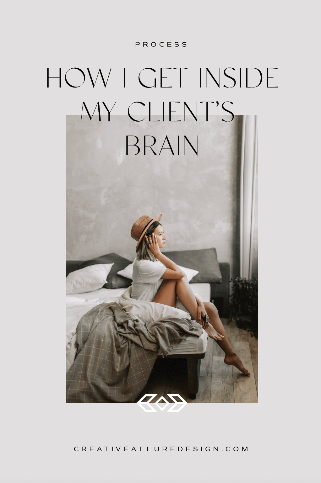
How I get inside the brains of my clients and keep revision requests to an absolute minimum.
One of the biggest struggles as a designer is getting inside the brains of our clients.
It’s not common to find a client who can communicate what they like, or why they like something.
So you send out 4 to 6 design concepts just hoping one would hit the mark. You wait with anxiety and anticipation for their feedback. When you do get feedback you end up revising so many times that the end result is nothing like what you started with. Projects feel frustrating for both yourself and your client.
When a designer is consistently “missing the mark”, the problem usually isn’t the client’s inability to communicate. It’s the designer’s inability to ask the right questions and work through the right process to get inside the brain of a client.
Having designed brands and websites for over ten years, I’ve had the opportunity to work with a wide range of clients, refining my process again and again. I’ve finally figured out how to get inside the brains of my clients…even the non creative ones. I provide 2…MAYBE 3 concepts with full confidence my clients will love one or ALL of the concepts I present. It’s rare that I have more than 2 revision requests and its not uncommon to have none or only simple modifications based on target market goals.
So how do I get in my client’s head and keep revisions to a minimum?
There are a few aspects of my process that go into feeling confident about starting a design for a client. This includes asking the right questions and holding their hand through my design preparation homework. But the biggest secret is connecting visually with my client.
Let’s look at an image together:
If you were the client I might ask, “Can you give me some adjectives that you see or feel when you look at this image.?” A real client of mine gave me the following:
Raw
Confidence
Strength
Minimal
Contemporary
I asked another client of mine the same question. Here’s what they responded with:
Staged
Alone
Weak
Messy
Boho
Same picture. Two VERY different interpretations. I’ll apply this same concept to logos, fonts even textures. This tells me so much about my client and what their expectations are for design.
Each individual interpretation of something can be different from one person to another. The key is that you have a visual to define those adjectives. Simply asking a client to give you some adjectives about the way they want their brand to look will never work unless you can visually ensure you are on the same page. For example. my interpretation of the word “professional” could be far different from my client’s interpretation of that same adjective. I need to actually SEE what their definition of “professional” is… TO THEM.
ANOTHER APPROACH to get inside the brain of YOUR CLIENTS
Let’s reverse our approach. Instead of starting with a photo, let’s start with a list of adjectives and ask the client to find an image that reflects those adjectives.
Balance
Grace
Contrast
Elegance
Sophistication
Soft
Dimensional
When I gave two clients the same list of adjectives, here’s what they each came up with:
CLIENT ONE
CLIENT TWO
TWO VERY DIFFERENT PHOTOS, but the same adjectives make sense. I now have a MUCH better understanding of each of these two different client’s brains. By implementing this kind of visual communication homework into my process, at the end of my strategy calls with client’s, I can look at a logo, font, image or texture and be able to apply the same adjectives my client would. That's how inside their brain I want to be BEFORE I start design.
This ensures that I am bringing THEIR VISION for their brand to life. I am sure that I know their specific interpretation of an adjective...not just my own.
The beauty of this exercise is that it can be applied to any creative industry.
THE OTHER KEY ASPECT TO KEEPING DESIGN REVISIONS TO A MINIMUM.
There’s something so many designers simply don’t take the time to do and that’s research. Researching the target market, researching the competition. Have you considered how this brand will grow with the company. Have you anticipated how the company intends to USE the brand? Can you show them how the brand could GROW as the business changes over time.
It’s not JUST about designing something beautiful or what the client is visually attracted to.
Guide your client’s PAST what their preferences are. Answer WHY the design will attract the target audience and HOW it will communicate the characteristics that make your client different from the competition. If your concepts do that AND align with what the client had envisioned, I guarantee you will have more, “WOWs” and less revisions.
If you are looking for a partner as you dive into creating or growing the business of your dreams, I would love to talk with you.


